CASE STUDY | UX Design & Brand Strategy

2,000 visitors expected, 80 greentech companies exhibiting — and a landing page that couldn't convert curiosity into registrations.

NEXPO Tallinn was the centrepiece of Tallinn Greentech Week 2023, held while Tallinn served as the European Green Capital. The event brought together 500+ investors, 100+ city delegates, and innovators from across Europe, Asia, and the USA. But the existing website buried critical information, created no urgency, and failed to communicate what made this event worth attending. I helped redesign the digital experience to merge environmental storytelling with conversion-focused design.
ROLE

UX/UI Designer

TEAM | AGENCY

3 designers
Twisted Sisters Agency

TOOLS

Figma

DURATION

2023

THE CONTEXT

Not just a conference, but a week-long ecosystem

NEXPO Tallinn wasn’t a standalone event. It was the anchor of Tallinn Greentech Week (November 13–17, 2023), a series of international conferences held while Tallinn held the title of European Green Capital. The landing page needed to serve as the single digital gateway to five interconnected sub-events, each with its own audience, schedule, and registration path.

2000+

Green technology enthusiasts from Europe, Asia & USA

500+

Investors, innovators & cleantech entrepreneurs

100+

City delegates from around the world

80+

Greentech companies exhibiting

The sub-events- Cleantech Forum Europe, Smart Cities Convention, GreenEST Summit, Green Tiger Conference, and the NEXPO exhibition itself- each targeted different audiences: investors, city officials, startup founders, academics, and technology enthusiasts. One landing page had to make all of them feel like they’d found the right place.

THE CHALLENGE

Information overload meeting zero urgency

The existing NEXPO website had a fundamental tension: it needed to serve as both an informational hub (what is this event, who’s speaking, which sub-event is for me) and a conversion engine (register now). It was doing neither well. The page was overloaded with static, text-heavy content. Key information like dates, venue (NEXPO City at Tallinn Creative Hub), and registration were buried below the fold.

🔴

Five events, one confused page

Cleantech Forum, Smart Cities Convention, GreenEST Summit, Green Tiger Conference, and the NEXPO exhibition all shared one landing page with no clear pathways for different audience types.

🔴

No sense of anticipation

The page was entirely static. No countdown, no evolving content, no speaker announcements dripping out over time. Zero reason for potential attendees to return before the event.

🔴

European Green Capital story untold

Tallinn’s 2023 Green Capital title was a massive credibility signal for the event. The previous site barely mentioned it, missing the chance to anchor the event in a larger narrative.

🎯

The goal

Create a landing page that’s intuitive, informative, and conversion-focused using visual hierarchy, interactive components, and brand storytelling to turn browsers into registrants across all five sub-events.

Three problems hiding behind one cluttered page

Before redesigning, we analyzed the existing site structure, content hierarchy, and user pathways. Three core issues emerged that shaped every design decision.

01

Users couldn't answer "is this for me?" quickly

With five sub-events targeting investors, city officials, startups, and academics, and no audience-based pathways, most visitors had to read everything to find what was relevant to them.

02

Static content killed return visits

Event landing pages have a unique challenge: they need to build momentum over weeks. A page that looks identical on day 1 and day 30 fails at creating the anticipation that drives early registration.

03

The brand story was decoration, not structure

Sustainability messaging was sprinkled through the body copy but never embedded in the design language itself. The visual experience could have been for any conference; there was nothing distinctly greentech about it.

THE STRATEGIC APPROACH

Three strategies to bridge information and action

Rather than just “making it look better,” we identified three strategic levers that each directly countered a specific insight.we

STRATEGY 01

Progressive disclosure

Structure the page as a guided narrative instead of dumping everything upfront. Lead with the emotional hook (why this matters), then reveal details as the user scrolls. Registration CTAs at every logical stopping point: after the value proposition, after the speakers, after the schedule.

STRATEGY 02

Dynamic anticipation

Add living elements: a countdown timer, an evolving news feed, and a schedule that updates as speakers are confirmed. Give users a reason to come back and create natural urgency as November 13 approaches.

STRATEGY 03

Brand as experience

Make the sustainability mission tangible through the design itself: a dark theme to reduce energy consumption. Green accents echoing nature. Tallinn’s European Green Capital story woven into the visual narrative and not just mentioned in a paragraph.

THE STRATEGIC APPROACH

Building the system in four phases

Given the scope, spanning both products and services and covering ordering, changing, and terminating, this had to be built incrementally. Each phase delivered value before moving to the next.

1

Streamlined user journey

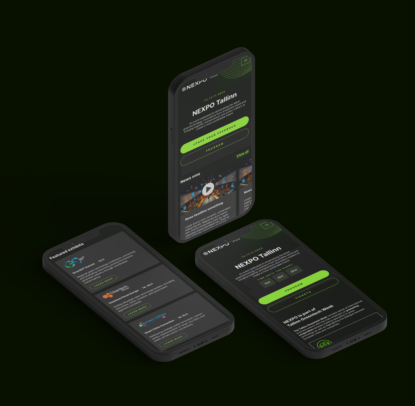
Restructured the entire page into a scroll-based narrative: hero with countdown → why attend → sub-event pathways → speakers → schedule → register. Each section answers the next natural question. Five sub-events (Cleantech Forum, Smart Cities Convention, GreenEST Summit, Green Tiger Conference, NEXPO exhibition) each get a distinct entry point.
↳ Strategy 01: Progressive disclosure

2

Interactive event schedule

A filterable, multi-day schedule (Nov 13–17) allowing users to browse by date, track, and sub-event — then bookmark sessions and add them to their calendar. Reduces friction from “interested” to “committed.”
↳ Strategy 02: Dynamic anticipation

3

Dynamic countdown & anticipation builder

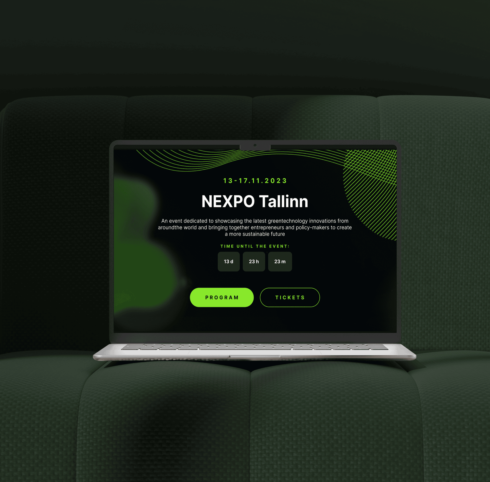
A live countdown timer embedded in the hero section, counting down to November 13. As Greentech Week approaches, the counter creates natural urgency without aggressive sales tactics, effective for international visitors planning travel.
 ↳ Strategy 02: Dynamic anticipation

4

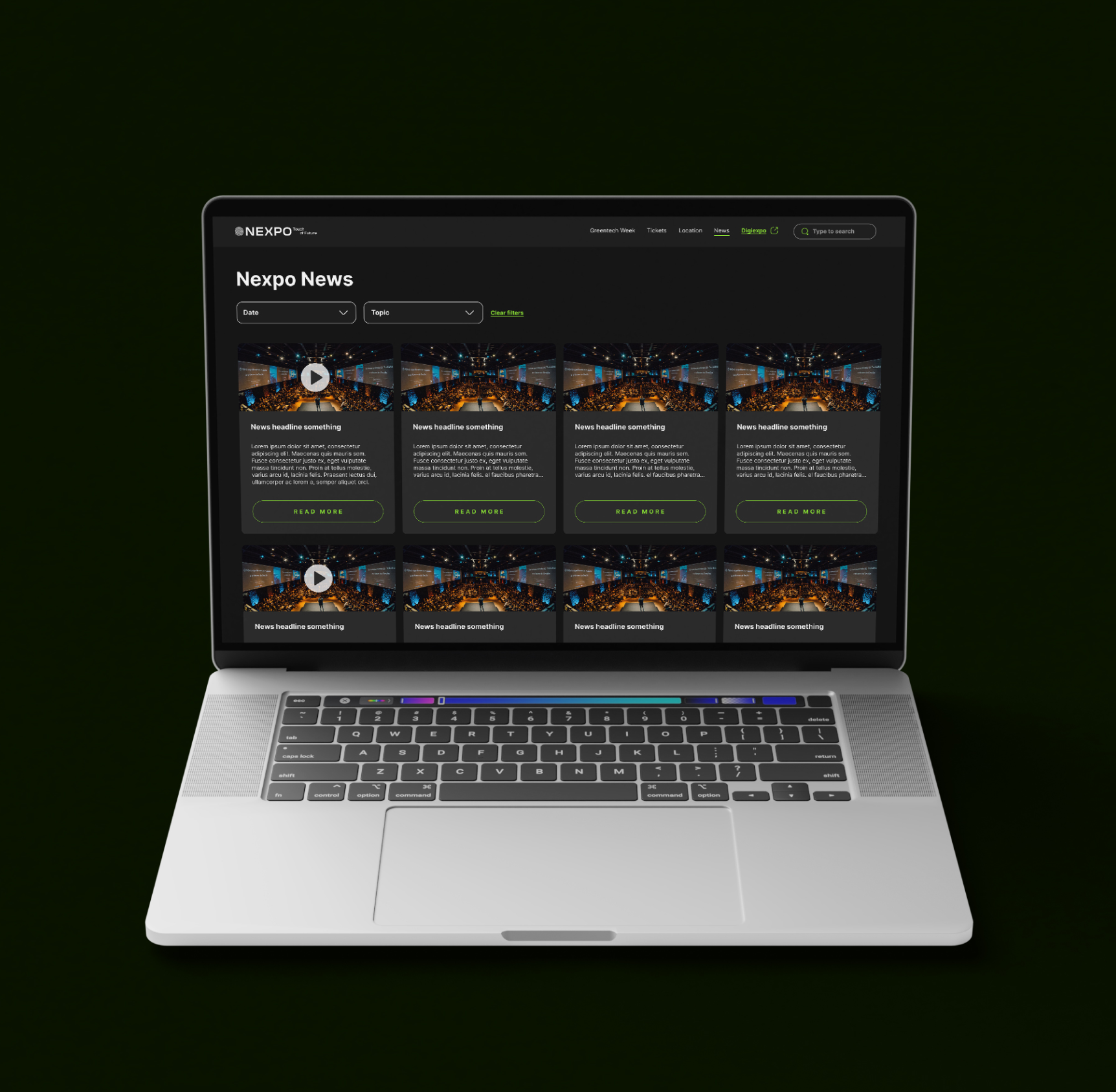
News & updates section

A curated feed surfacing speaker announcements, sponsor reveals, and sustainability insights. New content is rolled out weekly in the lead-up to the event, giving the page living content that rewards return visits and positions NEXPO as a thought leader.
↳ Strategy 02: Dynamic anticipation

5

Participant & exhibitor highlights

Showcased 80+ greentech companies and past attendees, from Estonian startups to global corporations. Social proof placed right before the registration CTA, at the decision point where visitors weigh whether the event is worth their time.
↳ Strategy 01: Progressive disclosure (social proof at decision point)

6

Integrated subscription flow

A subscription form woven naturally into the page, not as a pop-up, but as a logical next step after consuming content. Captures leads from visitors not yet ready to register, funnelling them into the email nurture sequence as the event date approaches.
↳ Strategy 01: Progressive disclosure (capture at every stage)

Where brand strategy meets product design

This project is a prime example of a cross-disciplinary approach.

Designing for NEXPO wasn’t just about UX patterns; it required understanding how environmental storytelling, visual identity, and conversion psychology work together. The dark theme wasn’t an aesthetic choice; it was a brand decision that reduced perceived energy consumption and visually aligned with the greentech mission. The green accent palette wasn’t decorative; it created an emotional throughline connecting the product to its purpose. And anchoring the narrative in Tallinn’s European Green Capital title gave the entire page a credibility signal that no amount of stock photography could match. This is the kind of brand-aware product thinking that most designers can’t do because they’ve only ever worked in one discipline.

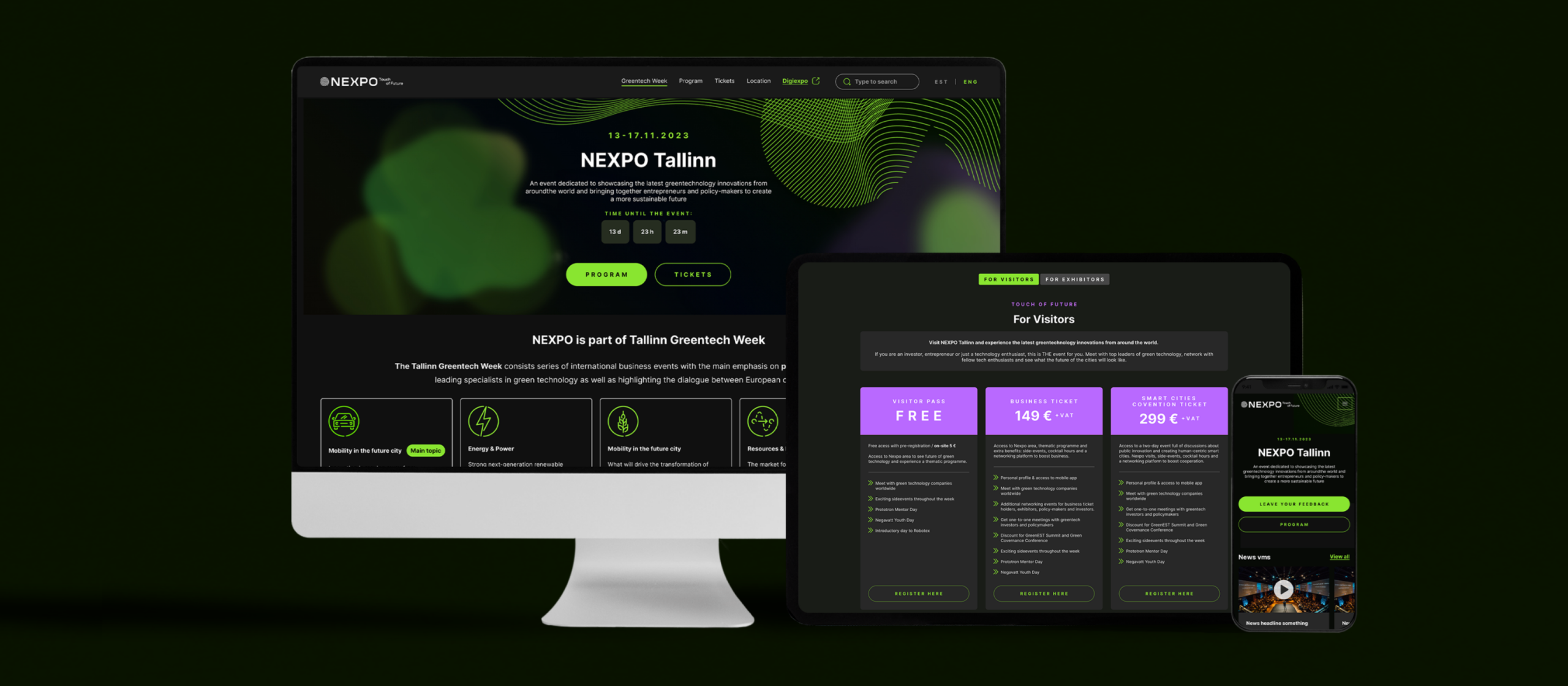
Responsive across all devices

RESULTS & IMPACT

From static brochure to conversion engine

🎯

Clear pathways for five audiences

Investors, city delegates, startups, academics, and technology enthusiasts can each find their relevant sub-event and register within seconds, and no longer be buried in a wall of text.

Dynamic engagement that builds momentum

The countdown timer, evolving news feed, and progressive speaker reveals created return visits and early registration momentum in the weeks leading up to November 13.

📱

Fully responsive for international visitors

With attendees from Europe, Asia, and the USA, and many discovering the event on mobile while travelling, the responsive experience ensures no visitor is lost to a broken layout.

🌿

Brand and mission made tangible

The design language doesn’t just describe sustainability; it embodies it. The dark theme, green palette, and European Green Capital narrative make the experience feel like a movement, not just a conference website.

THE REFLECTION

Lessons from merging brand and conversion design

What worked well

Framing every design decision through both a brand lens and a conversion lens forced sharper thinking. Instead of asking “does this look good?” we asked, “does this communicate the greentech mission AND move the user toward registration?” That dual filter applied to every section, every colour choice, every piece of copy, produced stronger solutions than either perspective alone would have. The European Green Capital anchor was particularly effective: it gave the entire page instant credibility without needing to hard-sell.

What I'd do differently

I’d set up analytics tracking from day one: registration funnel conversion rates, scroll depth heatmaps, and per-sub-event click-through rates. With five sub-events targeting different audiences, understanding which pathways converted best would have enabled targeted optimization. I’d also A/B test the countdown timer placement and the progressive disclosure sequence to quantify which content ordering drives the highest registration rate.

NEXT PROJECT

Transforming a complex cybersecurity portal